Design Exercise
TIAA - Checking Application: Applicant Details
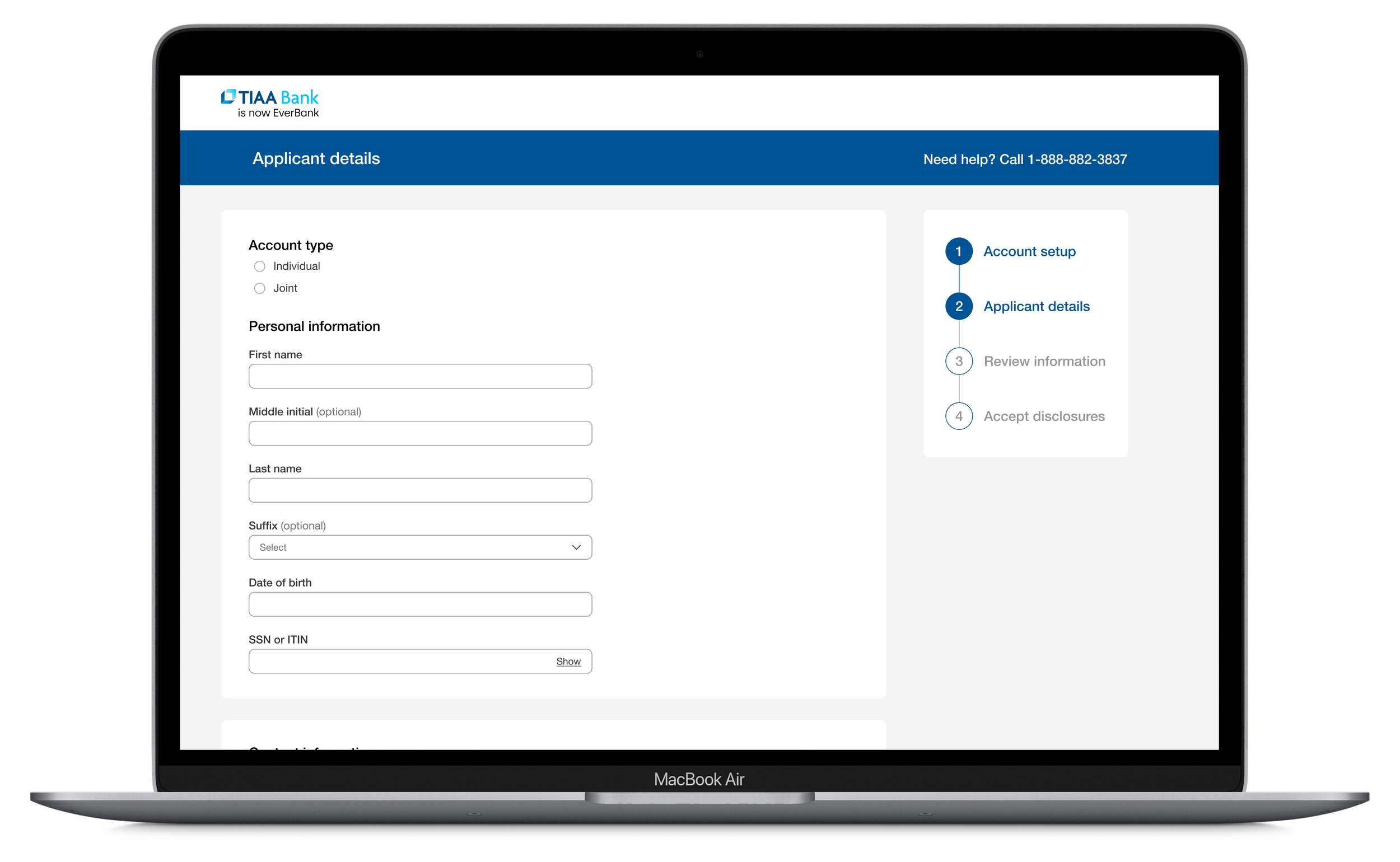
TIAA, now EverBank, is a market-leading retirement company and banking institution. Having led application platform and design teams, I had to check out one of their more basic product applications, an application for a checking account. Because I love working with forms and applications, I did three quick versions of the redesign: two 1-page experiences matching their current approach, and one multi-step approach. Based on my previous experience in the forms and applications space and all the user testing we did, I prefer the step-by-step approach for this experience.
While reviewing the application I noticed quite a few things, such as all the visual tug-of-war happenin. TIAA uses the “less clicks equals a better experience” approach, which has been proven to be substandard compared to a more multi-step approach. The difference in cognitive load and general friction between the two approaches is significant. During my redesigns, I addressed the following:
Reduced the contrast tug-of-war by adjusting color tones, size and colors of typefaces, input fields, etc.
Reworked the header slightly and included the help number.
Tried two different simple progress trackers.
Repositioned the “Continue” button so it’s in a more intuitive location.
Removed the selector for SSN/ITIN - functionality has been around for quite a while now that removes the need to select which one you’re inputting, allowing the user to enter which one works for them in one less step.
Changed select menus with only two options to radio button selections, per UX best practices.
Restructured the Security Code section to make it easier to both scan and complete.
Moved the Employment Information section up with the rest of the customer information.